Correlation
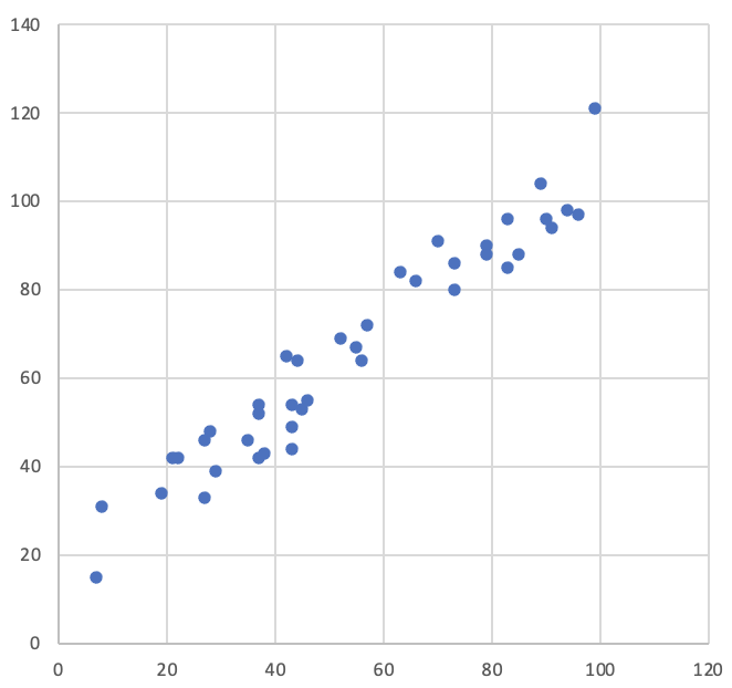
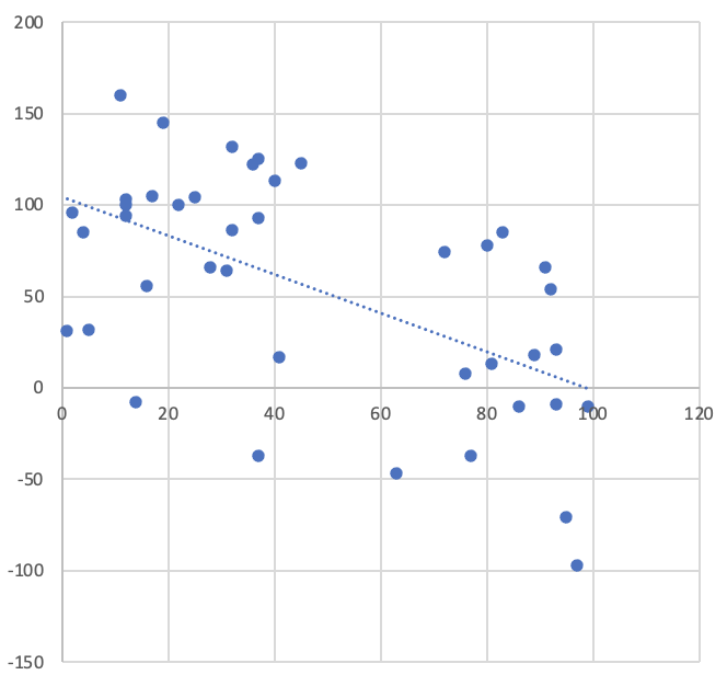
A positive correlation between two variables means that as one increases, so does the other. The inverse relationship, where one variable decreases as another increases, is known as negative correlation. Correlation describes the strength of the linear relationship between the variables and can be shown using a scatterplot like the one below. In the example, there is a clear linear trend to the data, and the gradient is positive showing a strong positive correlation between the variables.
Demonstrating that two variables are correlated does not mean that you can say that increasing one
of them causes the other to increase. To do that, you would need to perform a linear regression
in which an equation of the form Y = mX + c is derived to model the relationship between the
independent variable and the dependent variable. In an experimental study where you have carefully
manipulated the independent variable in a controlled setting and you see a correlation with the
measured values of the dependent variable, you can tentatively conclude a causal relationship.
A commonly-used measure of correlation between two variables is Pearson's r which ranges from zero to one, where zero indicates no relationship between the variables, and one represents perfect correlation. If the relationship is negative, then the value of r is also negative. Pearson's r is related to another measure of goodness-of-fit which is the coefficient of determination, R2. Technically, R2 is not always the same as the square of r; however, in most cases the relationship does hold.
| Correlation | examples |
|---|---|
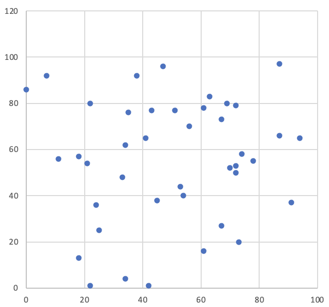 Uncorrelated: r=0.082, R2=0.0067 Uncorrelated: r=0.082, R2=0.0067 |
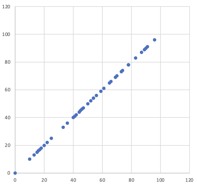 Perfectly correlated: r=R2=1 Perfectly correlated: r=R2=1 |
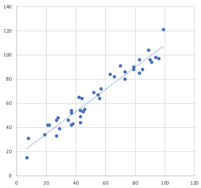 Strongly positively correlated: r=0.964, R2=0.93 Strongly positively correlated: r=0.964, R2=0.93 |
 Moderately negatively correlated: r=-0.567, R2=0.32 Moderately negatively correlated: r=-0.567, R2=0.32 |
The values of Pearson's r can be divided into classes which represent relationships of different strengths. The table below shows how to interpret both r and R2 (remember that r can be either negative or positive) (Dancey, 2014, p. 178).
| Strength | r | R2 |
|---|---|---|
| Perfect | 1 | R2 = 1 |
| Strong | 0.7 <= r < 1 | 0.49 <= R2 < 1 |
| Moderate | 0.4 <= r < 0.7 | 0.16 <= R2 < 0.49 |
| Weak | 0.1 <= r < 0.4 | 0.01 <= R2 < 0.16 |
| Uncorrelated | r = 0 | R2 = 0 |
Practical exercise
In this exercise, we will use Excel to investigate the relationship between temperature and ice cream sales. Our hypothesis is that the higher the temperature, the more ice creams are sold.
To do the exercise, you will need to download and open the example spreadsheet.
The file contains two columns of values: the first is the number of ice creams sold on a particular day, and the second is the maximum temperature on the same day.
Pearson's r
Excel provides a function to calculate Pearson's r. The diagram below illustrates how to insert the function.
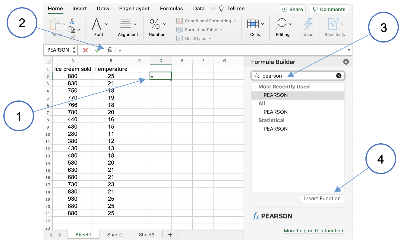
- Click on an available cell in the spreadsheet
- Click the function insertion tool
- Search for the Pearson function
- Click to insert the function
This will activate a second dialog where you can specify the parameters the functin will use.
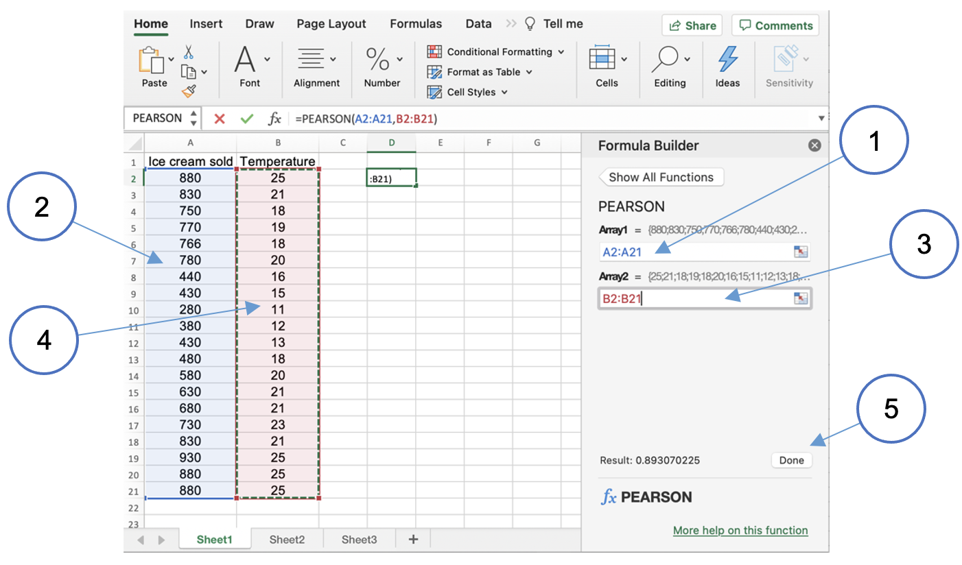
- Click in the field labelled
Array1 - Highlight the ice cream column
- Click in the field labelled
Array2 - Highlight the temperature column
- Click
Done
The value of Pearson's r (0.831 in this instance) will be displayed in the field. This shows that there is a strong correlation between the temperature and the number of ice creams sold.
Coefficient of determination (R2)
Excel also provide a function to calculate the coefficient of determination. It is called RSQ, and
you could insert it in the same way as the Pearson function. However, there is another way to find
the coefficient of determination which is often more convenient. The first step is to create a
scatterplot from the data.
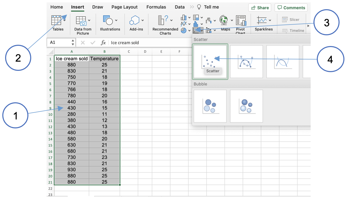
- Highlight both columns of data including the column headings
- Click on the
Inserttab in the Excel ribbon - Choose the
X Y scatteroption - Choose the simple scatterplot
One of the standard options on the Excel scatterplot is to add a trendline. Follow the steps in the following diagram.
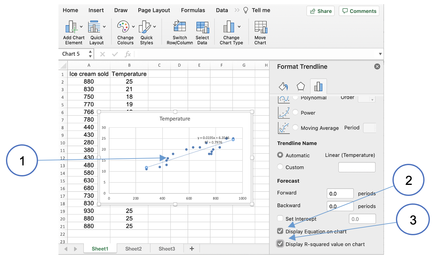
- Right-click on one of points in the data series and choose
Add trendline...from the pop-up menu - Click the checkbox to display the equation on the chart
- Click the checkbox to display the R2 value on the chart
You can use the generated value to check that R2 is the square of Pearson's r.