Student's t-test
Developed in 1908 by William Sealy Gosset, the t-test is used to compare two sets of results to determine whether there is a significant difference between them. It is one of a number of tests that rely on a comparison of the variance in distributions. The main concept is that when the variance is large, there is more chance that any difference between the average value of both sets is the result of natural variation. In the illustrated below the means of the blue and orange distributions are the same in both cases. However, when the variance is large, the two distributions overlap much more than when it is small. The difference between the means needs to be greater with a large variance to be sure that it is significant.
| Small | Large |
|---|---|
 |
 |
| Small variance = small overlap | Large variance = large overlap |
There are two main variations of the t-test depending on the source of your two sets of data. As with many statistical tests, the t-test only holds when certain assumptions are met. The assumptions vary depending on the type of t-test.
Paired t-test
If the two sets of data you are comparing come from the same subjects under different test conditions, you need to use a paired t-test. This would the case, for example, if you wanted to test the hypothesis that users preferred one website design over another. You would collect two sets of data from the same group of people, one for each design.
The paired t-test assumes
- There are no significant outliers
- The data is normally distributed
When collecting paired data for a paired test, it is important to avoid ordering effects. For example, if you were to show design A first to all subjects followed by design B, it may be that your subjects prefer design A because it was first, not because they perceive it to be better. Randomising the order in which the designs are presented would counteract this issue.
Independent t-test
If the two sets of data you are comparing come from different subjects, you need to use an independent t-test. This would be the case, for example, if you want to test the hypothesis that females have more social media contacts than males. You would collect one set of data from each gender.
The independent t-test assumes
- All observations are independent
- There are no significant outliers
- The data is normally distributed
- The variance of both sets of data is more or less equal
To be rigorous, these assumptions should be checked and an alternative test used if they do not hold. In practice, the differences have to be fairly large to invalidate the test. Please check out the further reading links at the bottom of the page for more information.
Practical exercise: independent t-test
In this exercise, we will be using the results from a small survey of students who were asked for the number of contacts on their primary social media account along with some demographic data. We will be attempting to answer the question, Do female students have more social networking friends than male students? This means that our hypotheses are as follows:
Null hypothesis (H0): there is no difference in the numbers of contacts between male and female students
Alternative hypothesis (H1): female students have more friends than male students
In a real situation, we would expect the dataset to be a lot larger than the example we are using here.
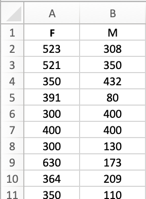
Setting up the data
When you first open the spreadsheet, the data is arranged in a single list where each row
corresponds to a different student. To be able to apply the Excel t-test function, the data
needs to rearranged to separate the data for male and female students into different columns.
We can also ignore most of the columns because they are not relevant to our particular
question. Start by removing all but the Gender and Friends columns. This should mean
that the Gender values are in column A and the Friends values are in column B.
Next, order the data by gender and move the male data to columns C and D starting in
row 2.
After that, replace the column heading Friends with F and add M in column D.
You can now delete columns A and C. This should leave you with just
two columns of data, one with the number of contacts for female students and the other with
the equivalent data for male students, and both should have appropriate column headings as
shown below.
Checking the assumptions
1 Outliers
A good test for outliers in a series is to identify points that lie more than three standard deviations away from the mean. These values can all be found using standard Excel functions. Another simple way is to insert a scatterplot of each series. Outliers tend to stand out as spijes in the plot. The plot of the data for female students below clearly shows that two of the data points are very far away from the rest. The orange dashed lines marks three standard deviations from the mean. These outliers need to be removed to avoid skewing the results. The same can be done for the male data.

Scatterplot of data series showing outliers
2 Normal distribution
Again, an Excel chart can be used to check that the data is more or less normally distributed. To do this, you will need to construct a frequency table. First, find the minimum and maximum values in the female contacts data. These values - 20 and 729 in this example - give the range that you will need to cover. The range is quite large, so 50 is probably a good size for each frequency bucket. In an empty part of the spreadsheet, set out a column of figures from 0 to 800 in steps of 50. In the column to the right, set out a second set of figures from 50 to 850 in steps of 50. In the next column to the right, enter the following formula to count the number of values that fall into each of the buckets:
1 | |
The example assumes that the contact data is in the range A2:A34 and that the table
of figures which defines the buckets starts in G18. The dollar signs indicate an
absolute cell reference which will not be automatically updated when you copy the
formula down to all the other rows in the frequency table. The conditions ensure that
values are only included in a bucket if they are greater than or equal to the lower
bound, but strictly less than the upper bound. This avoids both omitting values and
double-counting. You should end up with a table that looks like this:
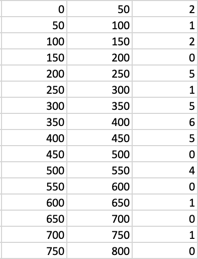
Frequency table
You can then use the calculated frequencies to create a bar chart. The result (below) has some gaps, but in general the rough shape of a normal distribution can be discerned. With a larger dataset, the fit would tend to be better.

Frequency plot
3 Equal variances
Simply calculating the variances of both sets of data will give you two numbers, but no way on knowing how close they have to be to considered similr enough that the t-test would be valid. Fortunately, there is a statistical test you can do to make the decision for you.
In an empty cell of the spreadsheet, insert the Excel function F.TEST. Its two parameters
are the two sets of data whose variances you want to compare. Here, that means the array of
female contact data and the array of male contact data.
The result of the test is a probability value. If it is less than 0.05, the difference between the variances is significant at the 95% level, and the t-test may not give valid results, although Excel provides a way around this - see below. In this case, the value of the F-test is slightly greater than 0.05 and so it is legitimate to use the t-test.
Applying the test
Choose a convenient empty cell in the spreadsheet, click on the Insert Function button (
labelled [fx]) and insert the TTEST function. Inserting the function in this way should
reveal the Formula Builder panel as shown below.
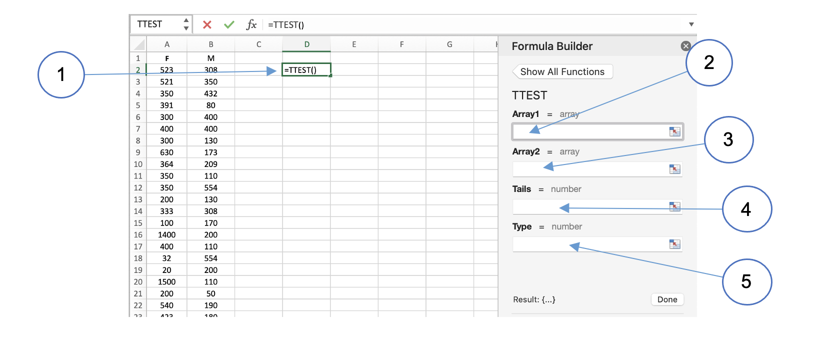
After inserting the function (1), place your cursor in the field labelled Array1 (2) and
highlight the data in column A. Next, go to the field Array2 (3) and highlight the data
in column B. We are testing whether females students have more contacts than male students,
so the direction of the difference is already determined. This means that you are doing a
one-tailed test and so you need to enter 1 into the Tails field (4). Finally, indicate
that you want to do an independent t-test for data of equal variances by entering 2 into
the field labelled Type (5). Note that for data where the variances are different, entering
a value of 3 in this field will apply the appropriate mathematical corrections.
You should find that the result of the t-test is around 0.17 which is greater than the 0.05 threshold. We therefore accept the null hypothesis at the 95% level: female and male students have equal numbers of social media contacts.
To conduct a paired t-test where you have two sets of data from the same test subjects under different conditions, the procedure in Excel is very similar. The main difference is the choice of test type (5).