Building a user interface in Android
There are two methods for constructing a UI in Android. If you are familiar with a Java framework such as Swing you will already know how to create UI elements programmatically. Android also provides a way to design screen layouts using a declarative XML format. For complex layout, the XML approach is often easier because it separate layout issues from procedural code, and you can concentrate on your design without worrying about where or when certain items are created.
Common elements
The Android framework offers many types of layout view and interface element which should serve you adequately in the vast majority of situations. You should not need to define your own custom components unless you want to do something very much out of the ordinary. In general, the UI for an activity is based on a View which defines the way in which components are arranged on the screen. Within the View, you arrange the specific elements needed to support the operations that you want the user to perform. The main layout options are shown in Figure 7.
| Text | Image |
|---|---|
| Linear layout: A layout that organizes its children into a single horizontal or vertical row. It creates a scrollbar if the length of the window exceeds the length of the screen. |  |
| Relative layout: Enables you to specify the location of child objects relative to each other (child A to the left of child B) or to the parent (aligned to the top of the parent). |  |
| Web view: Displays web pages. | 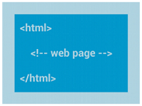 |
| List view: Displays a list of scrollable items. |  |
| Grid view: Displays items in a two-dimensional, scrollable grid. |  |
Figure 7: Common Android layouts
Your choice of layout view provides a parent structure in which to arrange the control widgets that you need. Control elements form a hierarchical structure with the view as the parent. Table 1 summarises some of the main components that you might need to use.
| Control | Description |
|---|---|
| Button | A push-button that can be pressed, or clicked, by the user to perform an action. |
| Text field | An editable text field. You can use the AutoCompleteTextView widget to create a text entry widget that provides auto-complete suggestions |
| Checkbox | An on/off switch that can be toggled by the user. You should use checkboxes when presenting users with a group of selectable options that are not mutually exclusive. |
| Radio button | Similar to checkboxes, except that only one option can be selected in the group. |
| Toggle button | An on/off button with a light indicator. |
| Spinner | A drop-down list that allows users to select one value from a set. |
| Pickers | A dialog for users to select a single value for a set by using up/down buttons or via a swipe gesture. Use a DatePicker widget to enter the values for the date (month, day, year) or a TimePicker widget to enter the values for a time (hour, minute, AM/PM), which will be formatted automatically for the user's locale. |
Table 1: Common controls
 Android UI